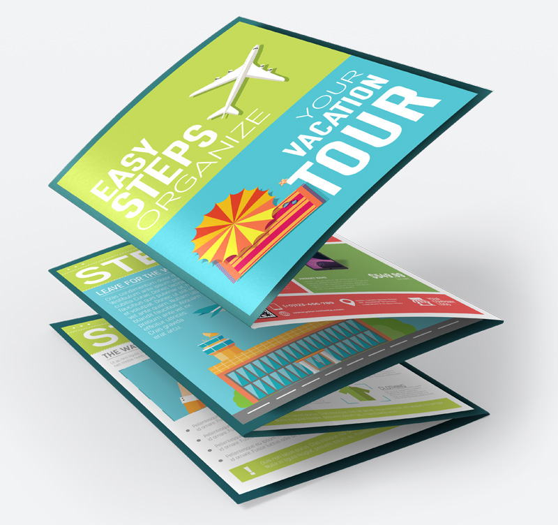
Designing an effective leaflet isn’t just about colours and fonts—it’s about precision. Every printed piece must look sharp, aligned, and professional. Three elements play a vital role in achieving this: bleed, margins, and grid systems. These design fundamentals ensure that your flyer leaflet design is print-ready, visually appealing, and free from layout errors.
This blog explores how these elements work together to elevate the quality and consistency of A4 flyers, ensuring your final design meets both creative and technical excellence.
1. Understanding Bleed in Print Design
Bleed is one of the most critical yet often overlooked aspects of leaflet printing. It’s the extra area added around your artwork to prevent unwanted white borders after trimming.
What is Bleed and Why It Matters
- Bleed usually extends 3mm beyond the trim line on all sides of your leaflet.
- It ensures that when the leaflet is cut, no unprinted edges appear—even with minor trimming shifts.
- Without bleed, your design risks having uneven or white borders, which reduce professionalism.
Tips for Setting Up Bleed Correctly
- Extend all background colours, images, or patterns beyond the trim line.
- Keep text and logos inside the safe area, never extending into the bleed zone.
- Always check printer guidelines, as bleed requirements can vary slightly.
Bleed acts as your design’s safety cushion—it guarantees your flyer leaflet design prints perfectly from edge to edge.
2. Margins: Keeping Content Safe and Balanced
Margins are the quiet heroes of good composition. They provide breathing space and ensure that no crucial content is lost during trimming or binding.
Importance of Margins
- They maintain visual balance, ensuring text and images don’t feel cramped.
- Margins protect vital content like contact details or calls-to-action from being accidentally trimmed.
- They create a sense of order, giving your A4 flyers a professional, polished finish.
Setting Margins Strategically
- Maintain at least 5mm to 8mm safe margin inside the trim line.
- Use consistent margins across pages or panels for uniformity.
- Avoid placing decorative borders too close to the edge, as they may look misaligned after cutting.
A well-set margin doesn’t just frame your content—it enhances readability and keeps your message clear and uncluttered.
3. The Role of Grid Systems in Leaflet Layouts
A grid system is the structural foundation of any print design. It divides the page into evenly spaced sections, guiding where elements should sit for optimal balance and flow.
How Grids Improve Layout Design
- Ensure alignment between text, images, and shapes.
- Promote consistency across panels or sections.
- Create a logical reading flow that leads the viewer’s eye naturally through the content.
Types of Grids Commonly Used
Grid Type | Description | Best Used For |
Column Grid | Divides the page vertically; ideal for brochures or folded leaflets. | Text-heavy layouts |
Modular Grid | Combines rows and columns for flexibility. | Product catalogues or image-driven designs |
Hierarchical Grid | Allows uneven column widths for visual variety. | Creative and artistic layouts |
Using a grid keeps your flyer leaflet design balanced and cohesive, ensuring that every element feels connected rather than scattered.
4. Combining Bleed, Margins, and Grids for Print Perfection
When used together, these three design principles create a seamless and print-ready leaflet layout. They help designers move from concept to production with confidence.
Design Workflow Tips
- Start with your grid: Begin by setting up a clear grid layout to organise your content. It ensures consistency, proper alignment, and a balanced flow across your leaflet design.
- Apply margins: Establish adequate margins to protect important text and graphics. This prevents them from being cut off during trimming and keeps your layout visually comfortable.
- Add bleed last: Extend background colours or images slightly beyond the trim line. This guarantees clean, edge-to-edge printing without unwanted white borders after cutting.
Visual Consistency Across Panels
For folded A4 flyers, alignment between front, inside, and back panels is crucial. Grids ensure that columns and content flow naturally from one panel to the next, maintaining professional continuity.
By blending these principles, your leaflet gains technical precision and aesthetic harmony—resulting in a design that looks as good printed as it does on screen.
5. Practical Design Considerations for Professional Leaflets
Beyond structure, attention to finer details ensures your leaflet delivers the right impression. Designers should always account for readability, spacing, and proportion before sending artwork to print.
Key Considerations
- Typography balance: Maintain readability by using clear, legible fonts and creating a clear hierarchy between headings, sub-headings, and body text. This helps readers navigate content easily and keeps the design visually organised.
- Colour alignment: Always convert your artwork to CMYK mode before printing to ensure colour accuracy. This prevents unexpected tone shifts that often occur when RGB designs are printed.
- Image quality: Use high-resolution images of at least 300 DPI to avoid pixelation and ensure professional clarity. Crisp visuals reflect quality and make your leaflet more impactful.
- Consistency: Keep all design elements—spacing, alignment, and style—uniform across every page or panel. Consistency builds brand recognition and creates a cohesive, polished presentation.
A meticulous approach ensures your A4 flyers not only look professional but also maintain accuracy from digital design to physical print.
Conclusion
Precision, alignment, and structure define great print design. By applying bleed, margins, and grids thoughtfully, you can eliminate printing errors, achieve perfect balance, and present your brand at its best. These elements may seem technical, but they’re the foundation of professional design practice.
At VC Print, we ensure every project—from a simple folded leaflet to a complex flyer leaflet design—is crafted with these principles at its core. Our team understands how to blend creativity with print precision, delivering A4 flyers that capture attention and communicate your message with clarity and style.


